Plotting probability densities
Table of Contents
1 Plotting probability density functions
Functions to evaluate probability densities in R have names of the
form d<dabb> where dabb is the abbreviated distribution name. For
example, norm for the normal (or Gaussian) density, unif for the
uniform density, exp for the exponential density. A more complete
list of distributions and their abbreviations is given here.
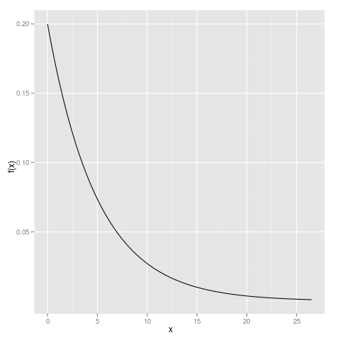
One simple way of plotting a theoretical density function is to establish a range of x values, evaluate the density (or probability mass function) on these values and plot the result.
It is not always straightforward to decide what a reasonable range of x values would be. For example, if I want to plot the exponential density for the rate, λ=0.2, how far out on the right-hand tail should I go? One way to answer this is to find, say, the 0.995 quantile.
(xmax <- qexp(0.995, rate=0.2))
[1] 26.49159
and choose equally spaced values from 0, below which the density is
zero, to xmax
xvals <- seq(0, xmax, length=100)
The plot can now be generated as
library(ggplot2)
qplot(xvals, dexp(xvals, rate=0.2), geom="line", ylab="f(x)", xlab="x")
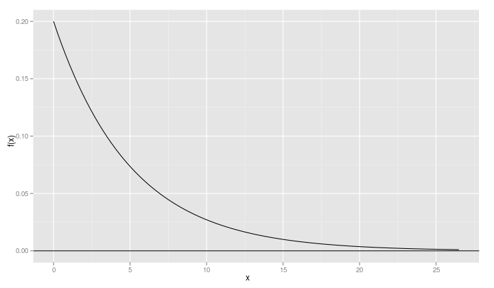
We can enhance this plot by adding a reference line at y=0 and
changing the aspect ratio.
qplot(xvals, dexp(xvals, rate=0.2), geom="line", ylab="f(x)",
      xlab="x") + geom_hline(yintercept=0)
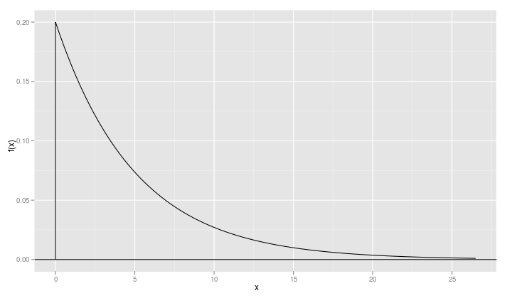
When a density function like the exponential density has a lower bound – 0 in this case – it is a good idea to include a point just slightly below the lower bound
xvals <- c(-1e-5, xvals)
so that a vertical line gets drawn on the plot.
2 Plotting multiple densities
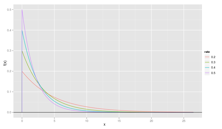
Often we want to plot multiple theoretical densities on the same set of axes so that we see the effect of changing parameter values. Suppose, for example, that we want to compare the exponential densities for λ=0.5, λ=0.4, λ=0.3 and λ=0.2
If we know the properties of the exponential distribution we will
realize that the current range of x values stored in xvals will
cover the region of non-negligible density for each of these
densities. If we didn't know that, we could redefine xvals based on
an xmax of
xmax <- max(qexp(0.995, rate=c(0.2, 0.3, 0.4, 0.5)))
As explained in the ggplot2 book, we should create a data frame with the x and y values for all the points we wish to plot, but in two columns with a third column indicating the rate.
2.1 Using melt to change a data frame from wide to long
One way to create such a representation is to start with good old cut-and-paste
df <- data.frame(xvals,
                 dexp(xvals,rate=0.2),
                 dexp(xvals,rate=0.3),
                 dexp(xvals,rate=0.4),
                 dexp(xvals,rate=0.5))
names(df) <- c("x", "0.2", "0.3", "0.4", "0.5")
str(df)
+ + + > > 'data.frame':       101 obs. of  5 variables:
 $ x  : num  -0.00001 0 0.26759 0.53518 0.80278 ...
 $ 0.2: num  0 0.2 0.19 0.18 0.17 ...
 $ 0.3: num  0 0.3 0.277 0.256 0.236 ...
 $ 0.4: num  0 0.4 0.359 0.323 0.29 ...
 $ 0.5: num  0 0.5 0.437 0.383 0.335 ...
and then "melt" the data frame, preserving the x values.
str(fr <- melt(df, id="x"))
'data.frame': 404 obs. of  3 variables:
 $ x       : num  -0.00001 0 0.26759 0.53518 0.80278 ...
 $ variable: Factor w/ 4 levels "0.2","0.3","0.4",..: 1 1 1 1 1 1 1 1 1 1 ...
 $ value   : num  0 0.2 0.19 0.18 0.17 ...
from which we produce the plot of multiple densities
qplot(x, value, data=fr, geom="line", ylab="f(x)",
      xlab="x", color=variable) + geom_hline(yintercept=0)
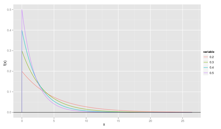
It is slightly more informative if we change the name of the variable called "variable" to "rate".
names(fr) <- c("x", "rate", "value")
The structure of the df data frame
str(df)
'data.frame': 101 obs. of  5 variables:
 $ x  : num  -0.00001 0 0.26759 0.53518 0.80278 ...
 $ 0.2: num  0 0.2 0.19 0.18 0.17 ...
 $ 0.3: num  0 0.3 0.277 0.256 0.236 ...
 $ 0.4: num  0 0.4 0.359 0.323 0.29 ...
 $ 0.5: num  0 0.5 0.437 0.383 0.335 ...
head(df)
           x       0.2       0.3       0.4       0.5
1 -0.0000100 0.0000000 0.0000000 0.0000000 0.0000000
2  0.0000000 0.2000000 0.3000000 0.4000000 0.5000000
3  0.2675918 0.1895777 0.2768581 0.3593971 0.4373843
4  0.5351836 0.1796985 0.2555013 0.3229156 0.3826100
5  0.8027754 0.1703342 0.2357920 0.2901373 0.3346953
6  1.0703671 0.1614578 0.2176030 0.2606863 0.2927809
is called the "wide" format. Each x value corresponds to multiple y values and it is the column positions or names that distinguish which response is which.
The structure of fr is the corresponding "long" format. All the
responses are in one column and we distinguish the parameter values by
with an auxillary column.
2.2 Using expand.grid to generate the long format directly
An alternative approach is to set up the "x" and "rate" columns of the data frame and evaluate the density on these two long vectors.
str(fr <- within(expand.grid(x=xvals, rate=c(0.2,0.3,0.4,0.5)),
                 value <- dexp(x, rate)))
'data.frame':   404 obs. of  3 variables:
 $ x    : num  -0.00001 0 0.26759 0.53518 0.80278 ...
 $ rate : num  0.2 0.2 0.2 0.2 0.2 0.2 0.2 0.2 0.2 0.2 ...
 $ value: num  0 0.2 0.19 0.18 0.17 ...
 - attr(*, "out.attrs")=List of 2
  ..$ dim     : Named int  101 4
  .. ..- attr(*, "names")= chr  "x" "rate"
  ..$ dimnames:List of 2
  .. ..$ x   : chr  "x=-0.0000100" "x= 0.0000000" "x= 0.2675918" "x= 0.5351836" ...
  .. ..$ rate: chr  "rate=0.2" "rate=0.3" "rate=0.4" "rate=0.5"
The expand.grid function creates a data frame of two columns
containing all possible combinations of the two vectors given as its
arguments (although it is not restricted to just two arguments). We
then evaluate the density on those combinations of values of x and
rate.
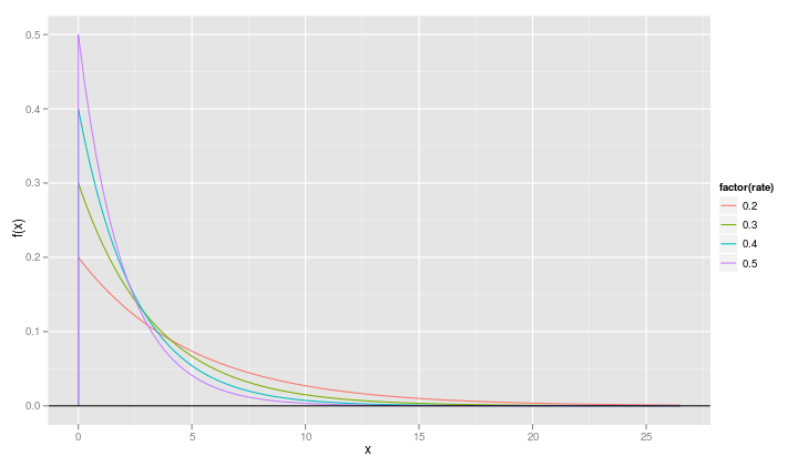
We do need to make one small change in the call to qplot because
rate is now a numeric variable and we want it to be treated as a
factor in the plot.
qplot(x, value, data=fr, geom="line", ylab="f(x)",
      xlab="x", color=factor(rate)) + geom_hline(yintercept=0)
Date: 2010-08-25 Wed
HTML generated by org-mode 7.01h in emacs 23