Due to data confidencial issues, only codes are summarized.
Basic format
Key points: - larger text - white background - proper position/rotation/content of label or title or legend
ggplot(data) + #data frame
geom_bar(aes(x=x, y=value, fill=label), stat = "identity") + #bar plot
facet_grid( ~ type, scales="free_x") + # one panel for one type variable
geom_text(aes(label=value), size = 6, position=position_dodge(width=0.9), vjust=-0.25) + # add value to each bar with proper position
theme(axis.text = element_text(angle = 0, hjust = 1, size=16, colour="black"), # text at ticks can be rotated by angle to avoid overlap labels
      plot.title = element_text(size=22), # title size
      axis.title = element_text(size=16), # axis label size
      panel.border = element_rect(colour = "black", fill=NA, size=0.5),
      panel.grid.major = element_line(colour="lightgrey"), # background grid
      panel.grid.minor = element_blank(),
      panel.background = element_rect(fill="white"), #  white background instead of default grey
      legend.text = element_text(size = 16), # legend text size
      legend.title=element_text(size=16),
      strip.text = element_text(size=16, colour="black"),
      strip.background = element_rect(colour="black")) +
labs(x="x aixs label", y="y axis label", size=15) + # axis label
ylim(0, 1) + xlim(0, 1) + # lim of x or y
ggtitle("Average Number of Significant Contacts (Transcript Factors) ") # plot title
No label and no tick with flexible legend position
ggplot(data, aes(x = Type, y = value, fill = Type)) +
geom_bar(stat = "identity") +
geom_text(aes(label=value), size = 6, position=position_dodge(width=0.9), vjust=-0.25) +
theme(axis.text = element_text(angle = 0, hjust = 1, size = 16, colour = "black"), plot.title= element_text(size=22),
          axis.ticks.x = element_blank(), # no ticks on x
          axis.text.x = element_blank(), # no text on x
          axis.ticks.y = element_blank(),
          axis.text.y = element_blank(),
          axis.title.x = element_blank(), # no label on x
          axis.title = element_text(size=16),
          panel.border = element_rect(colour = "black", fill=NA, size=0.5),
          panel.grid.major = element_line(colour="lightgrey"),
          panel.grid.minor = element_blank(),
          panel.background = element_rect(fill="white"),
          legend.text = element_text(size = 16),
          legend.title=element_text(size=16),
          legend.justification = c(1,1), # move legend into the panel
          legend.position = c(0.95,0.95), # legend is at the right upper conner
          strip.text = element_text(size=16, colour="black"),
          strip.background = element_rect(colour="black"))
Scatter plot with size and color label
library(virids) # one of my favoriate color package
ggplot(data) +
  geom_point(aes(x = run, y = delay, size = speed, fill=load), color = "black", shape = 21) + # scatter plot size determined by speed, filled color determined by load, boundary of the cycle point is black.
  scale_fill_viridis(discrete = TRUE) + # discrete value
  geom_text(aes(x = run, y = delay, label = timing), hjust = 0, vjust = 1.5) # add label to each scatter point
scatter plot with smooth regression or linear regression
ggplot(data) +
geom_point(aes(x = run, y = delay, fill = load)) +
geom_smooth(aes(x = run, y = delay, color = load), method = "loess", se = FALSE) # method can be lm for linear regression or loess for smooth regression; group by load will end up with several regressions of each group.
# se = TRUE will give Confidence Interval
boxplot with lines
- add median summary line
p <- ggplot(data, aes(x = dose:brand, y = pcnt)) +
geom_boxplot(aes(fill = ratio)) +
stat_summary(fun.y = median, geom = "line", position = "identity", aes(x = dose:brand, y = pcnt_ratio, group = 1), size = 1.6) + # add a thick line connecting the median value of each group of boxplot
ylab(label = "Response (after / before ratio)") +
xlab(label = "Dose : Brand") +
guides(fill = guide_legend(title = "ET Ratio")) + # change legend title - to remove legend: guides(fill = FALSE)
theme(axis.text = element_text(angle = 0, hjust = 1, size=16, colour="black"),
      plot.title=element_text(size=16, hjust = 0.5),
      axis.title = element_text(size=16),
      panel.border = element_rect(colour = "black", fill=NA, size=0.5),
      panel.grid.major = element_line(colour="lightgrey"),
      panel.grid.minor = element_blank(),
      panel.background = element_rect(fill="white"),
      legend.text = element_text(size = 16),
      legend.title=element_text(size=16),
      strip.text = element_text(size=16, colour="black"),
      strip.background = element_rect(colour="black"))
ggsave("Keyplot1.pdf", p) # another way to save the plot other than pdf() and dev.off()
- add regression line
ggplot(data) +
  geom_boxplot(aes(x = factor(Day),y = Proportion, color = Treatment), size =0.8) + # x is factor level by using x = factor(, level = c("")) to determine x order
  stat_smooth(method = "loess", aes(x = factor(Day), y = Proportion, group=Treatment, color = Treatment), se=FALSE, size=0.8) +
  scale_color_viridis(discrete = TRUE) +
  facet_wrap(~Application, nrow = 2) + # divide into several panel by Application with 2 rows.
  theme(legend.position = "bottom", legend.direction = "horizontal") # legend is placed at bottom and direction is horizontal instead of vertical on the right
Color
Sequencial color gradient(color brewer) Highly recommended!
library(RColorBrewer)
ggplot(data, aes(logFC, -log2(p))) +
    geom_point(aes(colour = -log2(p))) +
    scale_color_gradient(high = "black", low = "#05D9F6") + # higher value is black but smaller value scatter point is defined as #05D9F6
    theme(axis.text = element_text(angle = 0, hjust = 1, size=16, colour="black"),
          plot.title=element_text(size=16, hjust = 0.5),
          axis.title = element_text(size=16),
          panel.border = element_rect(colour = "black", fill=NA, size=0.5),
          panel.grid.major = element_line(colour="lightgrey"),
          panel.grid.minor = element_blank(),
          panel.background = element_rect(fill="white"),
          legend.text = element_text(size = 16),
          legend.title=element_text(size=16),
          strip.text = element_text(size=16, colour="black"),
          strip.background = element_rect(colour="black"))
library(viridis)# devtools::install_github(“sjmgarnier/viridis”)
Again, one of my favoriate color package which I also find easy to distinguish.
“Use the color scales in this package to make plots that are pretty, better represent your data, easier to read by those with colorblindness, and print well in grey scale.”
- To modify local image size in markdown:
`<img src="{{ site.baseurl}}/images/viridis.png" alt="Drawing" style="width: 400px;"/>`
- Manhattan plot
manhattan(data, logp = FALSE, suggestiveline = F, genomewideline = F , col = plasma(n=7, alpha = 0.4,begin = 0.2, end = 0.9) , ylim = c(-8, 8), cex=0.7) # manhattan plot - scatter plot for genome data with chromosome local
- hexbin plot
Too many black points in the figure? Use hexbin plot to find underlying pattern!
library(RColorBrewer)
ggplot(data, aes(x, y)) +
    stat_binhex(bins = 100) +
    scale_fill_gradientn(colours = brewer.pal(8, "Spectral"), trans = "log10", labels = trans_format('log10', math_format(10^.x))) +
    theme(axis.text = element_text(angle = 0, hjust = 1, size=16, colour="black"),
          plot.title=element_text(size=16, hjust = 0.5),
          axis.title = element_text(size=16),
          panel.border = element_rect(colour = "black", fill=NA, size=0.5),
          panel.grid.major = element_line(colour="lightgrey"),
          panel.grid.minor = element_blank(),
          panel.background = element_rect(fill="white"),
          legend.text = element_text(size = 16),
          legend.title=element_text(size=16),
          strip.text = element_text(size=16, colour="black"),
          strip.background = element_rect(colour="black"))
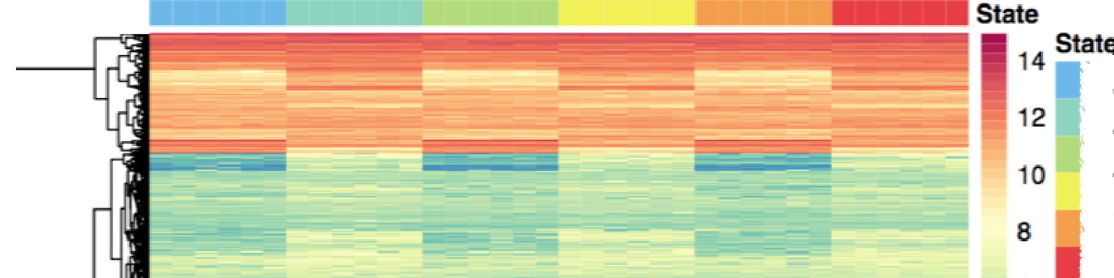
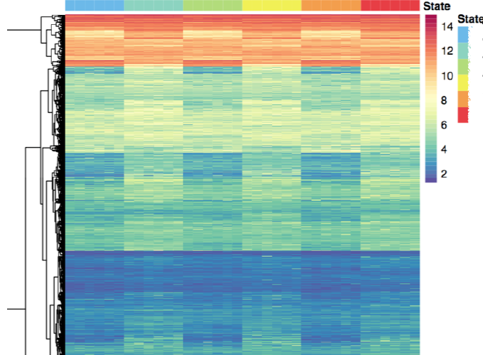
pretty heatmap
annotation <- data.frame(State = factor(rep(1:6, each = n),
                          labels = c("State1", "State2", "State3", "State4", "State5", "State6"))) # six states with n samples for each state
anno_colors <- list(State = State)

pheatmap(matrix,
         color = colorRampPalette(rev(brewer.pal(n = 11, name ="Spectral")))(40),
         annotation_colors = anno_colors,
         annotation = annotation, # labels for column groups which will appear in the state legend
         cluster_rows = T, #hierarchical clustering on the rows
         cluster_cols = F,
         show_rownames= F,
         show_colnames = F,
         filename = "heatmap_bound.pdf" #figure saved as pdf
         )
Density plot with histgram and fill in color
ggplot(data, aes(x = x, fill = label))+ geom_density(alpha = .3) # overlap density with transparent color

ggplot(data, aes(x = improve)) + # density plot with histgram
  geom_density(alpha = 0.3, fill = "#FF6666") +
  geom_histogram(aes(y = ..density..), color =
 "black", fill = "white", alpha = 0.5) +
  scale_x_continuous(breaks=c(5, 10, 15, 20,25, 30)) +
  labs(size=16) +
  theme(axis.text = element_text(angle = 0, hjust = 1.2, size=16, colour="black"),
          plot.title=element_text(size=20, hjust = 0.5),
          axis.title = element_text(size=18),
          panel.border = element_rect(colour = "black", fill=NA, size=0.5),
          panel.grid.major = element_line(colour="lightgrey"),
          panel.grid.minor = element_blank(),
          panel.background = element_rect(fill="white"),
          legend.text = element_text(size = 16),
          legend.title=element_text(size=16),
          strip.text = element_text(size=18, colour="black"))
xtable conveniently transfer test results into latex table! Really Handy!!
xtable(summary(lm(y~x, data = data)))
ggrepel for repeling overlapping text labels away from each other
ggplot(data, aes(x, y)) +
... +
geom_text_repel()
[Update!]
Final BIGGEST recommendation for publication figures:
+ ggpubr::theme_pubclean()or+ ggpubr::theme_pubr()is the only command needed to automatically get a clean and formal figure ready for publication without turning the above parameters at all!
License
Copyright 2017-present Ye Zheng.
Released under the MIT license.