Introduction
I create this page by integrating the information visualization with web search, to visualize the text from the Instant Web Query. The pipeline is, firstly query the data from web, then visualize the data.
Here is its twin page - WebViz, I wrote my own visualization toolkit.
Examples
Here list some live samples. You'd better to use Firefox or Chrome to play with them.
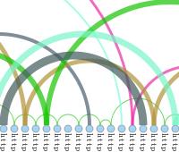
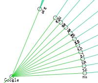
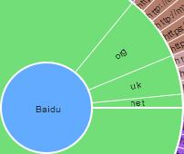
Domain Rings Diagrams
Input the keywords, query the text from web, visualize them by domain category.
Input the keywords, query the text from web, visualize them by domain category.
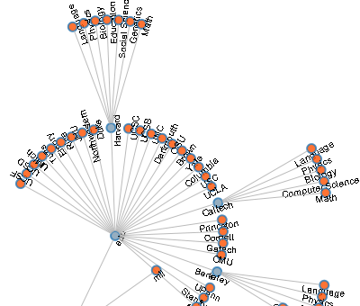
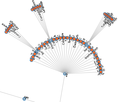
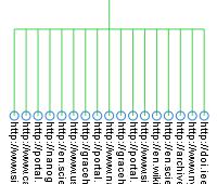
Node-Link Tree (algorithm 2)
Input the keywords, query the text from web, visualize them by domain category.
Input the keywords, query the text from web, visualize them by domain category.
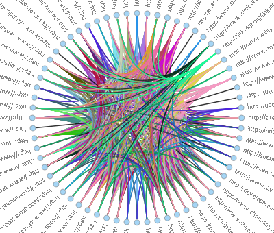
Domain Category Visualization
Input the keywords, query the text from web, visualize them by domain category.
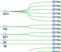
Input the keywords, query the text from web, visualize them by domain category.
<2>
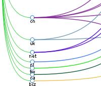
Input the keywords, query the text from web, visualize them by domain category.
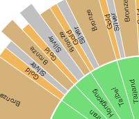
Domain Pie Visualization
Input the keywords, query the text from web, visualize them by domain category by Pie Graphs.
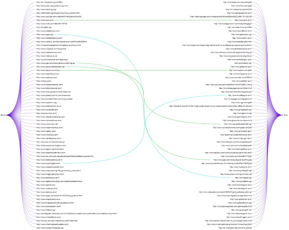
Opponent Visualization
Input the a pair of words, like Boys vs. Girls, or Good vs. Bad, query the most frequent links from web, then compare the relationship (e.g. same, logic same) between these two pairs of results, display the relationship by the different color. (green for same, light blue for logic same)
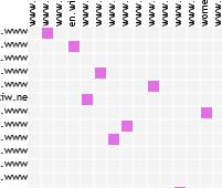
Matrix Domain Visualization
Input the a pair of words, like Boys vs. Girls, or Good vs. Bad, query the most frequent links from web, then compare the relationship (e.g. same, logic same) between these two pairs of results, display the relationship by the different color. (fresh red for same, light blue for logic same)
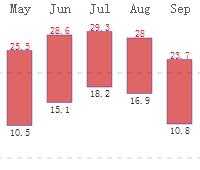
Weather of World Cities
Currently, I am constructing a service of weather visualization for the world cities.
For example: my hometown - Taiyuan.
