Prev: W7, Next: W9
Zoom: Link, TopHat: Link (936525), GoogleForm: Link, Piazza: Link, Feedback: Link, GitHub: Link, Sec1&2: Link
Slide:
# Live Plots on Flask Sites
📗 A function that returns an image response can be used for
@app.route("/plot.png") or @app.route("/plot.svg"). (SVG is Scalable Vector Graphics and vector graphics is represented by a list of geometric shapes such as points, lines, curves, Link, PNG is Portable Network Graphics and raster graphics is represented by a matrix of pixel color values, Link) ➩ An image response can be created using
flask.Response(image, headers={"Content-Type": "image/png"}) or flask.Response(image, headers={"Content-Type": "image/svg+xml"}), where the image is a bytes object and can be obtained using io.BytesIO.getvalue() where io.BytesIO creates a "fake" file to store the image. ➩ On the web page, display the image as
<img src="plot.png"> or <img src="plot.svg">. # Plotting Low Dimensional Data Sets
📗 One to three dimensional data items can be directly plotted as points (positions) in a 2D or 3D plot.
📗 For data items with more than three dimensions ("dimensions" will be called "features" in machine learning), visualizing them effectively could help with exploring patterns in the dataset.
📗 Summary statistics such as mean, variance, covariance etc might not be sufficient to find patterns in the dataset.
📗 For item dimensions that are discrete (categorical), plotting them as positions may not be ideal since positions imply ordering, and the categories may not have an ordering.
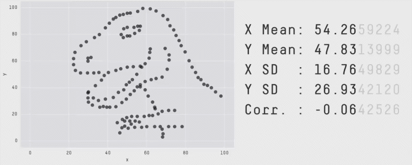
Dino DataSet
# Visual Encodings
📗 Position, size, shape (style), value (light to dark), color (hue), orientation, and texture can be used to present data points in different dimensions. These are called visual encodings.
📗 Some of these encodings are better for different types of features (data dimensions).
| Encoding | Continuous | Ordinal | Discrete (Categorical) |
| Position | Yes | Yes | Yes |
| Size | Yes | Yes | No |
| Shape | No | No | Yes |
| Value | Yes | Yes | No |
| Color | No | No | Yes |
| Orientation | Yes | Yes | Yes |
| Texture | No | No | Yes |
# Seaborn Plots
📗
seaborn is one of the data visualization libraries that can make plots for exploring the datasets with a few dimensions (features): Link ➩ Suppose the columns are indexed by
c1, c2, ..., then seaborn.relplot(data = ..., x = "c1", y = "c2", hue = "c3", size = "c4", style = "c5") visualizes the relationship between the columns by encoding c1 by x-position, c2 by y-position, c3 by color hue if the feature is discrete, and by color value if it is continuous, c4 by size, c5 by shape (for example, o's and x's for points, solid and dotted for lines) if the feature is discrete. # Multiple Plots
📗 For discrete dimensions with a small numbers of categories, multiple plots can be made, one for each category.
➩
seaborn.relplot(data = ..., ..., col = "c6", row = "c7") produces multiple columns of plots one for each category of c6, and multiple rows of plots one for each category of c7. ➩
seaborn.pairplot produces a scatter plot for each pair of columns (features) which could be useful for exploring relationships between pairs of continuous features too. Chernoff Face Example
📗 Chernoff faces can be used to display small low dimensional datasets. The shape, size, placement and orientation of eyeys, ears, mouth and nose are visual encodings: Link
➩ Facial features can be manually designed and plotted in
matplotlib. # Plotting High Dimensional Data Sets
📗 If there are large numbers of dimensions and data points, plotting them directly is inappropriate.
➩ To figure out the most important dimensions, which are not necessarily one of the original dimensions, unsupervised machine learning techniques can be used.
➩ One example of such dimensionality reduction algorithms is called Principal Component Analysis (PCA): Link, Link.
# Plotting Primitives
📗
matplotlib.patches contain primitive geometries such as Circle, Ellipse, Polygon, Rectangle, RegularPolygon and ConnectionPatch, PathPatch, FancyArrowPatch: Doc. # Ways to Specify Curves
📗 A curve (with arrow) from \(\left(x_{1}, y_{1}\right)\) to \(\left(x_{2}, y_{2}\right)\) can be specified by the (1) out-angle and in-angle, (2) curvature of the curve, (3) Bezier control points: Doc
➩
FancyArrowPatch((x1, y1), (x2, y2), connectionstyle=ConnectionStyle.Angle3(angleA = a, angleB = b) plots a quadratic Bezier curve starting from \(\left(x_{1}, y_{1}\right)\) going out at an angle a and going in at an angle b to \(\left(x_{2}, y_{2}\right)\). ➩
FancyArrowPatch((x1, y1), (x2, y2), connectionstyle=ConnectionStyle.Arc3(rad = r) plots a quadratic Bezier curve from \(\left(x_{1}, y_{1}\right)\) to \(\left(x_{2}, y_{2}\right)\) that arcs towards a point at distance r times the length of the line from the line connecting \(\left(x_{1}, y_{1}\right)\) and \(\left(x_{2}, y_{2}\right)\). # Bezier Curves
📗 Beizer curves are smooth curves specified by control points that may or may not be on the curves themselves.
➩ The curve connects the first control point and the last control point.
➩ The vectors from the first control point to the second control point, and from the last control point to the second-to-last control point, are tangent vectors to the curve.
➩ The curves can be constructed by recursively interpolating the line segments between the control points: Link.
➩
PathPatch(Path([(x1, y1), (x2, y2), (x3, y3)], [Path.MOVETO, Path.CURVE3, Path.CURVE3])) draws a Bezier curve from \(\left(x_{1}, y_{1}\right)\) to \(\left(x_{3}, y_{3}\right)\) with a control point \(\left(x_{2}, y_{2}\right)\). ➩
PathPatch(Path([(x1, y1), (x2, y2), (x3, y3), (x4, y4)], [Path.MOVETO, Path.CURVE4, Path.CURVE4, Path.CURVE4])) draws a Bezier curve from \(\left(x_{1}, y_{1}\right)\) to \(\left(x_{4}, y_{4}\right)\) with two control points \(\left(x_{2}, y_{2}\right)\) and \(\left(x_{3}, y_{3}\right)\). Curve Example
➩ Draw the mouth of a happy and an unhappy face using a Bezier curve.
Start point: (, )
End point: (, )
Control point: (, )
Control point: (, )
Start angle:
End angle:
Arc:
1
# Coordinate Systems
📗 There are four main coordinate systems: data, axes, figure, and display: Link.
➩ The primitive geometries can be specified using any of them by specifying the
transform argument, for example for a figure fig and axis ax, Circle((x, y), r, transform = ax.transData), Circle((x, y), r, transform = ax.transAxes), Circle((x, y), r, transform = fig.transFigure), or Circle((x, y), r, transform = fig.dpi_scale_trans). | Coordinate System | Bottom left | Top right | Transform |
| Data | based on data | based on data | ax.transData (default) |
| Axes | \(\left(0, 0\right)\) | \(\left(1, 1\right)\) | ax.transAxes |
| Figure | \(\left(0, 0\right)\) | \(\left(1, 1\right)\) | fig.transFigure |
| Display | \(\left(0, 0\right)\) | \(\left(w, h\right)\) in inches | fig.dpi_scale_trans |
📗 Note:
matplotlib has updated the function transform (for example, ax.transData.transform((1, 1))) so it no longer does the transformation correctly to the display or figure coordinate system, so it should not be used (they were used in examples and exams in the past few semesters). See "Warning" under "Data Coordinate System" here: Link. # Map Projections
📗 Positions on a map are usually specified by a longitude and a latitude. It is often used in Geographic Coordinate Systems (GCS).
➩ It is difficult to compute areas and distances with angles, so when plotting positions on maps, it is easier to use meters, or Coordinate Reference Systems (CRS).
# Regions on Maps are Polygons
➩ A region on a map can be represented by one or many polygons.
➩ A polygon is specified by a list of points connected by line segments.
➩ Information about the polygons are stored in
shp, shx and dbf files. # GeoPandas
➩
GeoPandas package can read shape files into DataFrames and matplotlib can be used to plot them, Link. ➩
geopandas.read_file(...) can be used to read a zip file containing shp, shx and dbf files, and output a GeoDataFrame, which a pandas DataFrame with a column specifying the geometry of the item. ➩
GeoDataFrame.plot() can be used to plot the polygons. # Conversion from GCS to CRS
➩
GeoDataFrame.crs checks the coordinate system used in the data frame. ➩
GeoDataFrame.to_crs("epsg:326??") or GeoDataFrame.to_crs("epsg:326??) can be used to convert from degree-based coordinate system to meter-based coordinate system. ➩ The
?? in the European Petroleum Survey Group (EPSG) code specifies the Universal Transverse Mercator (UTM) zone: Link. ➩ Madison, Wisconsin is in Zone 16.
Madison Map
➩ Find the data on Link on Madison city limit, lakes and rivers, and a list fire stations, and plot them on a map.
➩ Find the largest lake and the fire station closest to the center of the lake.
➩ Note:
cmap or colormaps specify the colors for the hue visual encoding for a column of numerical values, and the names of the colormaps can be found here: Link. # Creating Polygons
➩
Point(x, y) creates a point at \(\left(x, y\right)\). ➩
LineString([x1, y1], [x2, y2]) or LineString(Point(x1, y1), Point(x2, y2)) creates a line from \(\left(x_{1}, y_{1}\right)\) to \(\left(x_{2}, y_{2}\right)\). ➩
Polygon([[x1, y1], [x2, y2], ...]) or Polygon([Point(x1, y1), Point(x2, y2), ...]) creates a polygon connecting the vertices \(\left(x_{1}, y_{1}\right)\), \(\left(x_{2}, y_{2}\right)\), ... # Polygon Properties
➩
Polygon.buffer(r) computes the geometry containing all points within a r distance from the polygon. If Point.buffer(r) is used, the resulting geometry is a circle with radius r around the point, and Point.buffer(r, cap_style = 3) is a square with "radius" r around the point: Doc. # Polygon Manipulation
📗 Union and intersections of polygons are still polygons.
➩
geopandas.overlay(x, y, how = "intersection") computes the polygons that is the intersection of polygons x and y: Doc, if GeoDataFrame has geometry x, GeoDataFrame.intersection(y) computes the same intersection: Doc ➩
geopandas.overlay(x, y, how = "union") computes the polygons that is the union of polygons x and y, Doc, if GeoDataFrame has geometry x, GeoDataFrame.union(y) computes the same union: Doc ➩
GeoDataFrame.unary_union is the single combined MultiPolygon of all polygons in the data frame: Doc. ➩
GeoDataFrame.convex_hull computes the convex hull (smallest convex polygon that contains the original polygon): Link, Doc # Geocoding
📗
geopy provide geocoding services to convert a text address into a Point geometry that specifies the longitude and latitude of the location: Link ➩
geopandas.tools.geocode(address) returns a Point object with the coordinate for the address. # Questions?
test curve q
📗 Notes and code adapted from the course taught by Professors Gurmail Singh, Yiyin Shen, Tyler Caraza-Harter.
📗 If there is an issue with TopHat during the lectures, please submit your answers on paper (include your Wisc ID and answers) or this Google form Link at the end of the lecture.
📗 Anonymous feedback can be submitted to: Form. Non-anonymous feedback and questions can be posted on Piazza: Link
Prev: W7, Next: W9
Last Updated: June 27, 2026 at 9:06 PM