Examples
- There are several groups of plot modifiers to look at in the help section. You can access the documentation on these and many more by typing:
>> doc linespec
Here is an example of plotting two sets of points in the same figure:
     xx = 0 : 0.02 : 2 ;
     xx = xx * 2 * pi ;
     yy = sin(xx) ;
     plot( xx , yy , 'g--' , xx , cos(xx) , 'r' )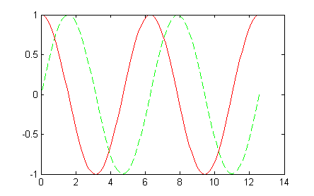
The first three arguments plot the sine function we showed earlier as a green dashed line. The second triplet (three arguments) are the same
xxcoordinates and a new set of values for the y-axis.Consider the difference between creating the x coordinates as shown above or by using a single
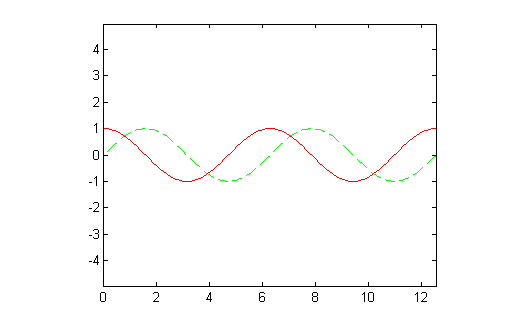
xx = 0 : 0.04 : 4*picommand. - While the plot is still showing, you can use the
axiscommand to force the same length units on the horizontal and vertical axes. Type:>> axis equal
- The examples so far have used the familiar x and y coordinates that you are familiar with in two-dimensional plotting. However, Matlab doesn't care what the variable names are. It is the position of the values in the
plotcommand that determine which values are plotted on the horizontal x-axis and which values are plotted on the vertical y-axis. Type these commands:pData = -3 : 0.1 : 3 ; qData = pData .^ 2 ; plot( pData, qData );
Which values,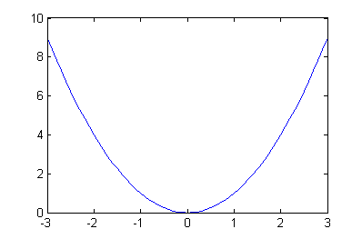
pDataorqData, are used as the x-coordinate and which are the y-coordinates? - This example produces the plot image that follows. Notice, the way all three sets of points are specified and included in the plot. Comments have been added to help you understand each line. Do not type this example in the Command Window (unless you really want to!). You can copy and paste this code to try it. Later, you will learn how to write scripts and you can write such a script then.
    t = 0:.01:4*pi;              % create many points for horizontal axis

    y1 = cos(t);                 % evaluate cosine at each t
    y2 = -cos(t);                % evaluate negative cosine at each t

    isect = (1:2:7)*pi/2;        % cosines intersect x-axis at multiples of pi/2
    z = zeros(1,4);              % zero values for y-axis vector   z=[0 0 0 0]

    % Plot three different sets of points on the same plot
    plot( t,y1,'k' , t,y2,'b--' , isect,z,'ro' );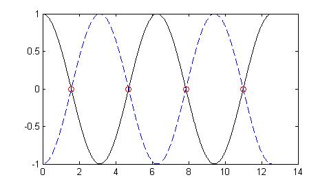
- This plot has a black solid line for the curve
y1=cos(t), a dashed blue line for the curvey2=-cos(t), and red circles marking the intersection of the two curves. While this plot is still active in the Figure Window, we can spruce it up a bit. For instance, if we enter the code:axis([0 4*pi -1 1]) grid on ylabel ('y(t)') xlabel ('t') title('y(t) versus t') print firstPlotwe get the plot:
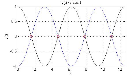
The plot has gridlines and labels as shown. The
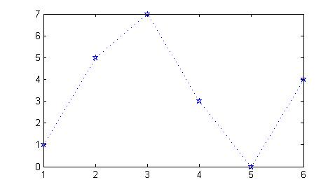
printcommand creates a postscript file of the plot namedfirstPlot.psin the current Matlab directory. - We can also use this form to create a plot where
yis a vector of y-coordinate values.plot( y,'specifications' )
The values of
yare plotted against their indices. The code below produces the plot in the next figure.y = [1 5 7 3 0 4]; plot(y,'b:p')