Prev: L22, Next: L24
# Lecture
📗 The lecture is in person, but you can join Zoom: 8:50-9:40 or 11:00-11:50. Zoom recordings can be viewed on Canvas -> Zoom -> Cloud Recordings. They will be moved to Kaltura over the weekends.
📗 The in-class (participation) quizzes should be submitted on TopHat (Code:741565), but you can submit your answers through Form at the end of the lectures too.
📗 The Python notebooks used during the lectures can also be found on: GitHub. They will be updated weekly.
# Lecture Notes
📗 Live Plots on Flask Sites
➩ A function that returns an image response can be used for
@app.route("/plot.png") or @app.route("/plot.svg"). (SVG is Scalable Vector Graphics and vector graphics is represented by a list of geometric shapes such as points, lines, curves, Link, PNG is Portable Network Graphics and raster graphics is represented by a matrix of pixel color values, Link) ➩ An image response can be created using
flask.Response(image, headers={"Content-Type": "image/png"}) or flask.Response(image, headers={"Content-Type": "image/svg+xml"}), where the image is a bytes object and can be obtained using io.BytesIO.getvalue() where io.BytesIO creates a "fake" file to store the image. ➩ On the web page, display the image as
<img src="plot.png"> or <img src="plot.svg">. Simple Plot Example
➩ Code to create the website: Notebook.
➩ Code to scrape that website: Notebook.
Plotting Low Dimensional Data Sets
➩ One to three dimensional data items can be directly plotted as points (positions) in a 2D or 3D plot.
➩ For data items with more than three dimensions ("dimensions" will be called "features" in machine learning), visualizing them effectively could help with exploring patterns in the dataset.
➩ Summary statistics such as mean, variance, covariance etc might not be sufficient to find patterns in the dataset.
➩ For item dimensions that are discrete (categorical), plotting them as positions may not be ideal since positions imply ordering, and the categories may not have an ordering.
Dino DataSet
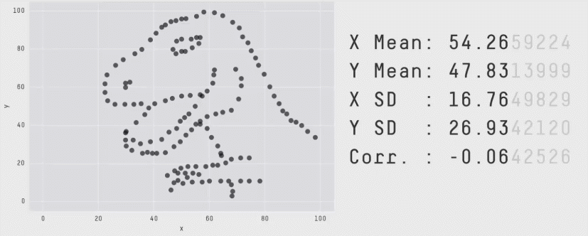
Image by Revolutions.
📗 Visual Encodings
➩ Position, size, shape (style), value (light to dark), color (hue), orientation, and texture can be used to present data points in different dimensions. These are called visual encodings.
➩ Some of these encodings are better for different types of features (data dimensions).
| Encoding | Continuous | Ordinal | Discrete (Categorical) |
| Position | Yes | Yes | Yes |
| Size | Yes | Yes | No |
| Shape | No | No | Yes |
| Value | Yes | Yes | No |
| Color | No | No | Yes |
| Orientation | Yes | Yes | Yes |
| Texture | No | No | Yes |
Seaborn Plots
➩
seaborn is one of the data visualization libraries that can make plots for exploring the datasets with a few dimensions (features): Link ➩ Suppose the columns are indexed by
c1, c2, ..., then seaborn.relplot(data = ..., x = "c1", y = "c2", hue = "c3", size = "c4", style = "c5") visualizes the relationship between the columns by encoding c1 by x-position, c2 by y-position, c3 by color hue if the feature is discrete, and by color value if it is continuous, c4 by size, c5 by shape (for example, o's and x's for points, solid and dotted for lines) if the feature is discrete. 📗 Multiple Plots
➩ For discrete dimensions with a small numbers of categories, multiple plots can be made, one for each category.
➩
seaborn.relplot(data = ..., ..., col = "c6", row = "c7") produces multiple columns of plots one for each category of c6, and multiple rows of plots one for each category of c7. ➩
seaborn.pairplot produces a scatter plot for each pair of columns (features) which could be useful for exploring relationships between pairs of continuous features too. Seaborn Plot Example
➩ Plot the grades by lab and lecture sections.
➩ Code to make the plots in seaborn: Notebook.
Chernoff Face Example
➩ Chernoff faces can be used to display small low dimensional datasets. The shape, size, placement and orientation of eyeys, ears, mouth and nose are visual encodings: Link
➩ Facial features can be manually designed and plotted in
matplotlib. ➩ Code to plot the faces: Notebook.
TopHat Discussion
➩ Which features of the faces are the most effective, i.e. if you want to divide the faces into groups (called "clusters" in unsupervised learning), which feature(s) would you use?
📗 Plotting High Dimensional Data Sets
➩ If there are large numbers of dimensions and data points, plotting them directly is inappropriate.
➩ To figure out the most important dimensions, which are not necessarily one of the original dimensions, unsupervised machine learning techniques can be used.
➩ One example of such dimensionality reduction algorithms is called Principal Component Analysis (PCA): Link, Link.
Notes and code adapted from the course taught by Yiyin Shen Link and Tyler Caraza-Harter Link
Last Updated: June 27, 2026 at 9:06 PM